Redesigned the package-sending feature to enhance usability and efficiency.

Design seamless user journeys for My FamiPort.
Create prototypes and conduct usability tests to uncover user pain points.
Analyse research findings to craft impactful design solutions.
Align design directions through clear communication with stakeholders.
Define flows and deliver visual assets for implementation.
Conduct interviews and observations to gather actionable insights.
The project team comprised 10 members, including 1 project manager, 4 developers, 1 UIUX designer (myself) and 4 marketing team members. I led UX research, UI design, and presentations to the project manager.
The redesigned application was downloaded by nine million users, representing over half of Taiwan's sixteen million primary consumers. Moreover, the revenue generated by members grew significantly, increasing from 17% in 2017 to over 35% in 2021.

App Store Reviews
Ratings
⭐️ 4.7/5 - High ratings reflect the commitment to providing a seamless, reliable experience that meets user needs every day.

Google Play Reviews
Downloads
Successfully boosted app downloads to over 1M on Google Play.
FamilyMart, a well-known convenience store chain from Japan, expanded to Taiwan in 1988, offering a wide range of services, including delivery, dining, transportation tickets, financial services, and fresh food. With over 4,000 stores in Taiwan and its app surpassing six million downloads since its launch, FamilyMart has become a major presence in the region.

Overview
People can use an app to send packages, saving time and avoiding the hassle of waiting in line. Given this convenience, it's worth exploring the development of a kiosk application.
The original My FamiPort app faced a low adoption rate due to usability issues caused by inconsistent icon design and a fragmented design system. Multiple iterations across different teams led to a lack of centralised documentation, further confusing users. My goal was to revamp the app by addressing these inconsistencies, creating a cohesive design system, and enhancing functionality and reliability to improve user adoption.
Our target audience consists of frequent My Famiport kiosk users. The key objectives are to resolve the current app's usability issues and refresh its brand image to provide a more user-friendly experience. We aim to gain a deeper understanding of how users interact with kiosks and their emotions about the process. Given that the app offers multiple services, we prioritised the most commonly used function—sending packages. By focusing on this feature first, we aim to address the core user need, improving the overall user experience by streamlining the package-sending process before expanding to other features.

Users input sending details directly in the app to receive a QR code for staff to scan
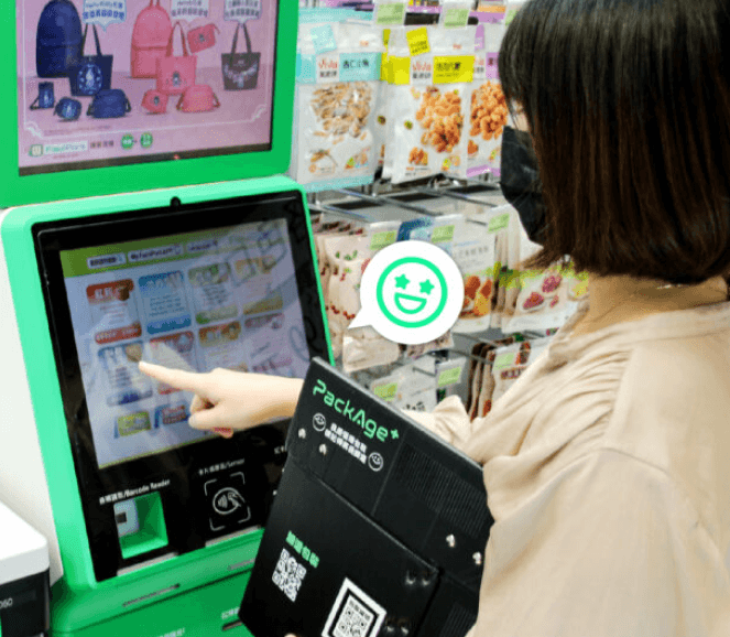
Users visited the physical store, used the kiosk to input details, printed the QR code

Handed the package to the staff
I conducted interviews and observations to gain insights into users' lifestyles and their experiences with kiosks. These conversations helped me understand their preferences and identify pain points, providing crucial information for improving the overall user experience.
Shadowing observation was a key method in this process. By observing users without interrupting their natural behaviours, I was able to capture authentic interactions and workflows, ensuring accurate insights into their usual practices.
Dive into users
My Famiport focuses on individuals aged 25 to 35, especially those who send packages frequently as part of their side hustle or main business. This group often manages multiple packages simultaneously, making the in-store kiosk experience cumbersome, time-consuming, and inconvenient.
Typing in details on a kiosk can be a hassle, especially with queues and the physical interaction required. Therefore, it is crucial to provide a tool that simplifies the package-sending process, making it easy and effortless.
I developed personas for our target users by analysing data from interviews and observations, enabling the team to better understand and empathise with their needs.

Inconsistent design
The icons and overall design lack coherence, which causes confusion and difficulty for users in navigating the app.
Repetitive data entry
Users often input incorrect information and must fill out the same text fields multiple times when sending multiple packages, which is tedious and prone to errors.
Package forgetfulness
Due to their busy schedules, users often forget to send packages, resulting in delays or missed shipments.
Difficult shipment code retrieval
After exiting the app, users struggle to find the shipment code again, which complicates the process when they return to the store to show the code to staff.
I collaborated with team members to generate a range of ideas for creating "How Might We" statements, aiming to transform key challenges into opportunities for innovation.
How might we provide a personal assistant service to remind users of their daily schedules?
How might we streamline the package-sending process to make it easier for users to navigate?
How might we create a consistent design system to make interfaces visually appealing?
After brainstorming ideas for improvements, I created a user flow to streamline the package-sending process. By mapping out the users' steps, we could better identify areas for simplification and ensure the process was intuitive and easy to navigate.
The design solutions focused on improving the package sending experience by providing clear and concise information throughout the process. We aimed to reduce repetitive data entry, making the process easier and more convenient for users.

Reducing Package Forgetfulness
To reduce package forgetfulness, we introduced a personal assistant feature in the app. This assistant actively reminds users of pending tasks, such as unshipped packages, by displaying them on the landing page. It offers personalised notifications based on the user's activity history and pushes relevant reminders and services.
A customised brand-new experience
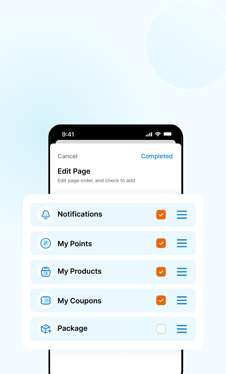
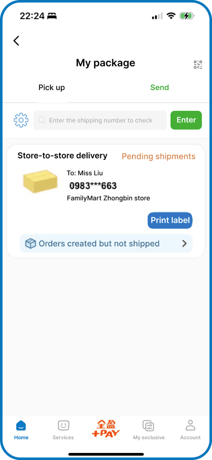
To improve the user experience, they can customise their exclusive screen to display the information that matters most to them. By personalising the package section on the screen, users will be able to view key details, such as the shipment code, directly on the landing page as soon as they enter the app.

Streamlining Package Entry with QR Code Autofill
To avoid repetitive data entry, the system includes an autofill feature that stores users' full names for quick reuse. Additionally, on the "My Package" page, users can utilise the QR code scanning function. By scanning the QR code from the platform where the order was placed, the system instantly retrieves the recipient's information. This eliminates the need to manually input details, streamlining the process and reducing the time and effort required for sending packages.
Homepage
The redesigned app features a consistent visual design, making it easier for users to locate what they need quickly. Additionally, users can now customise their homepage to prioritise the information and services most relevant to them.

Old

New

Old
New


