Surge Website Refresh: Strengthening Our Digital Identity
Role
UX/UI Design
Design System
Iconography
Interaction & Motion Design
Client
Surge Marketing Solutions
Industry
Digital Marketing & Creative Agency

MY ROLE
An in-house website redesign that transformed Surge's digital presence into a modern, engaging and conversion-focused experience that better reflects the agency's brand and expertise.
An in-house website redesign that transformed Surge's digital presence into a modern, engaging and conversion-focused experience that better reflects the agency's brand and expertise.
Led the UX and UI design of the Surge website refresh in collaboration with a developer, content writer, and internal stakeholders.
Collaborated with a developer, content writer, and stakeholders to refresh the Surge website.
Delivered the initial launch in six months, creating a modern, conversion-focused platform that continues to evolve through ongoing testing and performance-driven improvements.
Conducted stakeholder research to understand business goals, brand perceptions, pain points, and opportunities for improvement.
Audited the existing website to uncover usability, navigation, and user experience issues.
Developed a modern design system while retaining key elements of the existing brand to maintain recognition and familiarity.
Designed new visual styles, bespoke iconography, website components, and social media design guidelines.
Defined the overall visual direction of the refresh, from wireframes through to high-fidelity UI designs.
Established a scalable design language to support future website growth and ongoing brand consistency.
Led the UX and UI design of the Surge website refresh in collaboration with a developer, content writer, and internal stakeholders.
Collaborated with a developer, content writer, and stakeholders to refresh the Surge website.
Delivered the initial launch in six months, creating a modern, conversion-focused platform that continues to evolve through ongoing testing and performance-driven improvements.
Conducted stakeholder research to understand business goals, brand perceptions, pain points, and opportunities for improvement.
Audited the existing website to uncover usability, navigation, and user experience issues.
Developed a modern design system while retaining key elements of the existing brand to maintain recognition and familiarity.
Designed new visual styles, bespoke iconography, website components, and social media design guidelines.
Defined the overall visual direction of the refresh, from wireframes through to high-fidelity UI designs.
Established a scalable design language to support future website growth and ongoing brand consistency.
Surge Website Refresh: Strengthening Our Digital Identity
Role
UX/UI Design
Design System
Iconography
Interaction & Motion Design
Client
Surge Marketing Solutions
Industry
Digital Marketing & Creative Agency
Challange
The previous Surge website had become outdated, content-heavy and visually inconsistent. It no longer reflected the agency’s evolving brand, creative expertise or full range of services, while long user journeys and unclear messaging limited its ability to convert visitors into enquiries.
The previous Surge website had become outdated, content-heavy and visually inconsistent. It no longer reflected the agency’s evolving brand, creative expertise or full range of services, while long user journeys and unclear messaging limited its ability to convert visitors into enquiries.
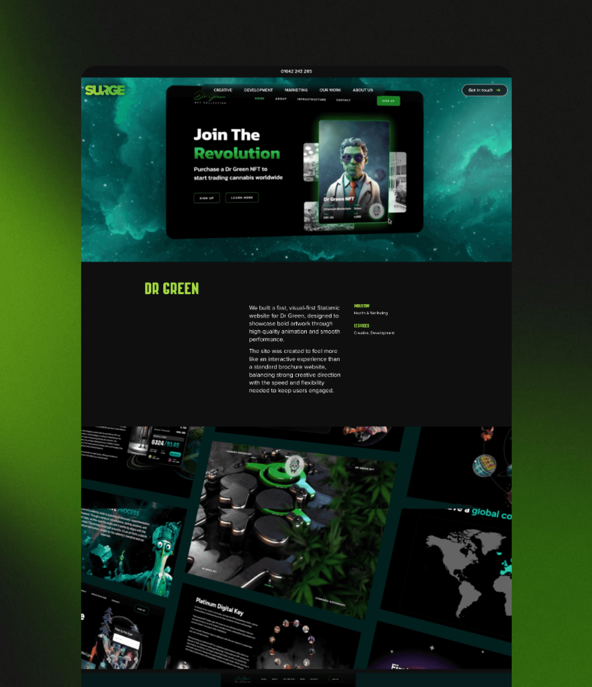
The redesign focused on refreshing Surge’s brand identity, introducing a new icon style and cohesive design system, while incorporating motion graphics and interactive elements to create a more modern and distinctive digital experience.
The redesign focused on refreshing Surge’s brand identity, introducing a new icon style and cohesive design system, while incorporating motion graphics and interactive elements to create a more modern and distinctive digital experience.


GOAL
The aim was to refresh Surge’s digital identity and create a modern, engaging website that better showcases our expertise, services and personality while improving the journey towards conversion.
The aim was to refresh Surge’s digital identity and create a modern, engaging website that better showcases our expertise, services and personality while improving the journey towards conversion.
The result is a more cohesive and distinctive digital experience, supported by a defined design system, bespoke iconography and motion-led interactions. The website continues to evolve based on performance and conversion data.
The result is a more cohesive and distinctive digital experience, supported by a defined design system, bespoke iconography and motion-led interactions. The website continues to evolve based on performance and conversion data.
SOLUTION
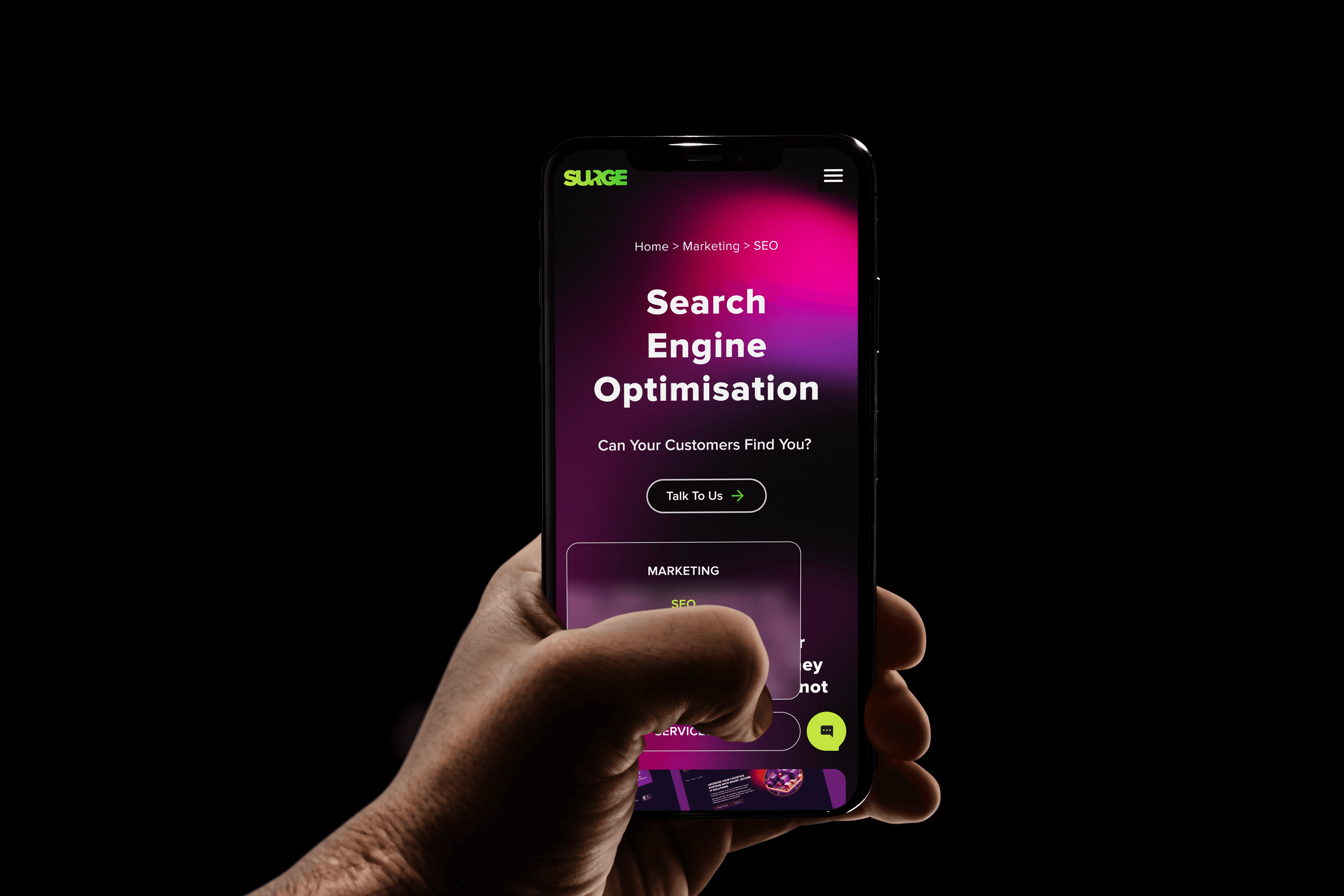
We crafted a modern visual identity using glassmorphism-inspired icons, dark backgrounds and motion-led interactions to create a stronger and more distinctive online presence. Details such as illuminated icon states bring the interface to life while reinforcing Surge’s creative personality.
We crafted a modern visual identity using glassmorphism-inspired icons, dark backgrounds and motion-led interactions to create a stronger and more distinctive online presence. Details such as illuminated icon states bring the interface to life while reinforcing Surge’s creative personality.
The platform was built around a cohesive design system, making the experience consistent, scalable and flexible as the brand continues to evolve.
The platform was built around a cohesive design system, making the experience consistent, scalable and flexible as the brand continues to evolve.


LESSONS LEARNED
I learned to balance strong visual design with usability, ensuring every design decision supports the user journey.
I learned to balance strong visual design with usability, ensuring every design decision supports the user journey.
I learned that simplifying a design doesn’t always improve the user experience. In the first version, I minimised the navigation to create a cleaner interface, but this made our services less discoverable and required users to scroll further to understand what Surge offered. In a later iteration, I redesigned the navigation using the glassmorphism style from our new visual identity and made the key services more visible and accessible. This taught me to balance visual simplicity with usability and to validate design decisions against real user journeys, not aesthetics alone.
I learned that simplifying a design doesn’t always improve the user experience. In the first version, I minimised the navigation to create a cleaner interface, but this made our services less discoverable and required users to scroll further to understand what Surge offered. In a later iteration, I redesigned the navigation using the glassmorphism style from our new visual identity and made the key services more visible and accessible. This taught me to balance visual simplicity with usability and to validate design decisions against real user journeys, not aesthetics alone.
Copyright © 2026 Chia An Liu
Let's connect!
Copyright © 2026 Chia An Liu
Let's connect!


Copyright © 2026 Chia An Liu
Let's connect!